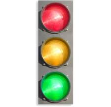
Every day, depending on the area you live in, you see this universal symbol telling you when to stop or go.  As part of Strategic Discipline we expect our clients to provide metrics for their company, team and individual performance. It’s a part of the weekly meeting agenda. That might seem sufficient to provide accountability, yet when conducting meetings we feel it’s important to dispense with the numbers as quickly as possible in order to get to the meatier topics that can help the business build momentum. The metrics need to communicate quickly whether success is being achieved or there’s work to be done.
That’s why we’ve taken to using this same set of colors you see on a stoplight to communicate quickly how well you’re doing on your metrics. Just as Green means go, in our business it indicates we’re on track to achieving the priority or goal set. Yellow means caution, we may be approaching success, or have run out of time and just come up short depending on the reporting cycle. Red means failure.
Yellow and Red let everyone in the meeting know there’s work to be done. If it happens too frequently a change in personnel may be necessary. However it could mean other things as well. Are you setting your objectives too high? Does your system need changes so it can perform better? Does the team need to be changed? Was there some event or challenge that prevented success?
By using the success criteria of red, yellow, green [and super green for letting everyone know you’re at the extreme level of success] your dashboard, for the company and for each individual, quickly communicates where the focus needs to be. It creates peer pressure since no one likes to fail.
One element to remember when building your dashboard, don’t forget the importance of setting priorities that balance your objectives, and the value of including leading and lagging indicators for your measurements.
How do you set red, yellow, green and super green priorities?
Let’s suppose your sales team is to reach a target of 36 units sold this quarter. For the sake of expediency we’ll say their target is 12 each month. Twelve would be the number you set in your columns for your green goal – hitting the target. Yellow you might set at 10-11, and anything less than 10 would be red. Set your super green goal at 14 or 15.
It might look like this for the month of July if you made your number.
|
Priority – Sales |
July |
August |
September |
Legend |
Red |
Yellow |
Green |
Super Green |
|
Units Sold |
12 |
|
|
# Sold |
<10 |
10-11 |
12 |
15 |
In weekly and monthly meetings these success criteria speed up reporting. It indicates quickly where resources and time need to be invested to achieve success.
Send me an email if you’d like to see a template with a better example in Excel with the words Quarterly Dashboard in the subject line.
You should be setting metrics for every priority you have, and these metrics and success criteria should cascade down to every individual in your company. Imagine what it would be like to see a dashboard on everyone’s desk in your business. Would you have any question on whether your people are being accountable?
Individual dashboards can be challenging to master. We recommend investing the time to have your executive team first master this before asking individual team members to begin posting their personal dashboards. Individual dashboards require a set of metrics [often just 1 or 2] that monitor their contribution to the company priorities and a second more important set of numbers that monitor their “day” job. The latter is their required expectations/standards for their position.
Okay we’ve covered dashboards for weekly and monthly meetings. We’re ready now to set the agenda for the monthly meeting. That’s our next blog.


.jpeg?width=150&height=135&name=Hand%20with%20marker%20writing%20the%20question%20Whats%20Next_%20(1).jpeg)

